UI/UX / WEB DESIGN
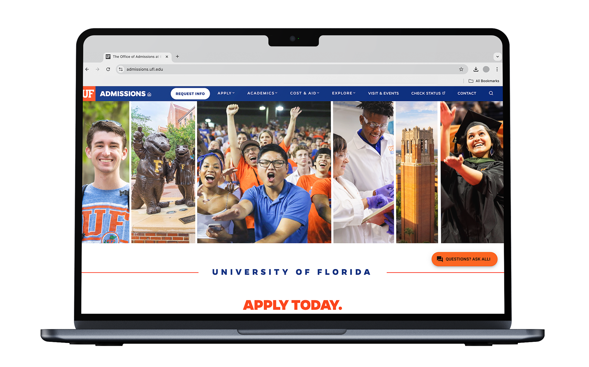
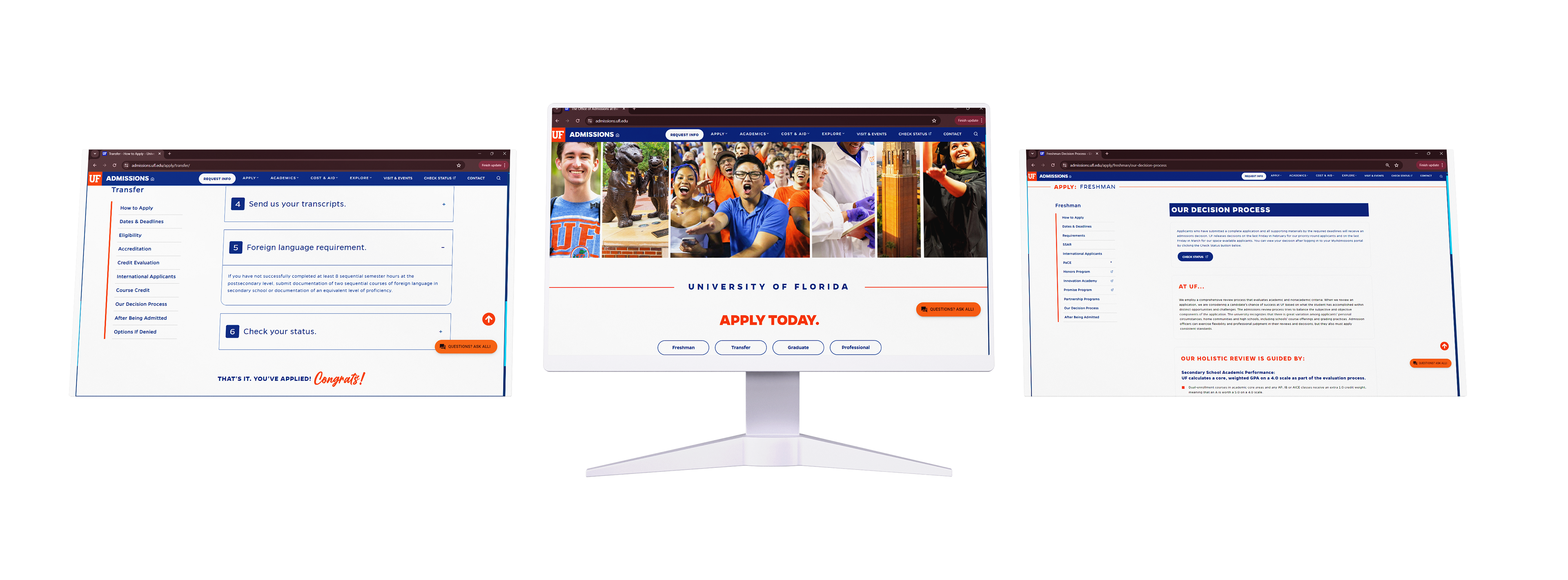
The UF Admissions website receives over 64,000 freshman, transfer, and graduate applications annually. With such a large quantity of applicants, a reliable and straight-forwards user experience is imperative.
ROLE: GRAPHIC DESIGNER
SOFTWARE: FIGMA, ILLUSTRATOR
DELIVERABLES: COMPLETE WEB REDESIGN
CREATIVE TEAM: HANNAH CAUDILL, CAT PAROLINE, ELLA TERRAN, TIFFANY FANG, EMMA HOWARD
THE ASK
The UF Admissions department realized their need for an updated site for prospective students. Over the span of two and a half weeks my team successfully designed a highly functional, intuitive website that created an effortless user experience.
RESEARCH
This website redesign taken on by my team at The Agency was driven by extensive research into user preferences.
The team conducted a thorough analysis of user needs, leading to the development and implementation of design assets and iterative revisions. Significant enhancements were made to the website’s copy to ensure alignment with modern standards and user expectations.
This strategic approach not only modernized the website’s aesthetic and functional elements but also significantly improved its overall user experience. We went beyond the status quo of an apathetic, sterile feel to showcase an emotional design, pushing the client outside of their comfort zone to amplify the impact of their admissions site.
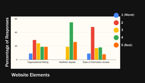
Survey-based user testing indicated key site areas for our team to improve, such as using familiar terms in the section names to make it easier to find statistics.
Information accessibility was one of the primary concerns. Through qualitative interviews, we found that website visitors were worried they would miss key information because of the excessive content on the site.
DESIGN FOUNDATIONS
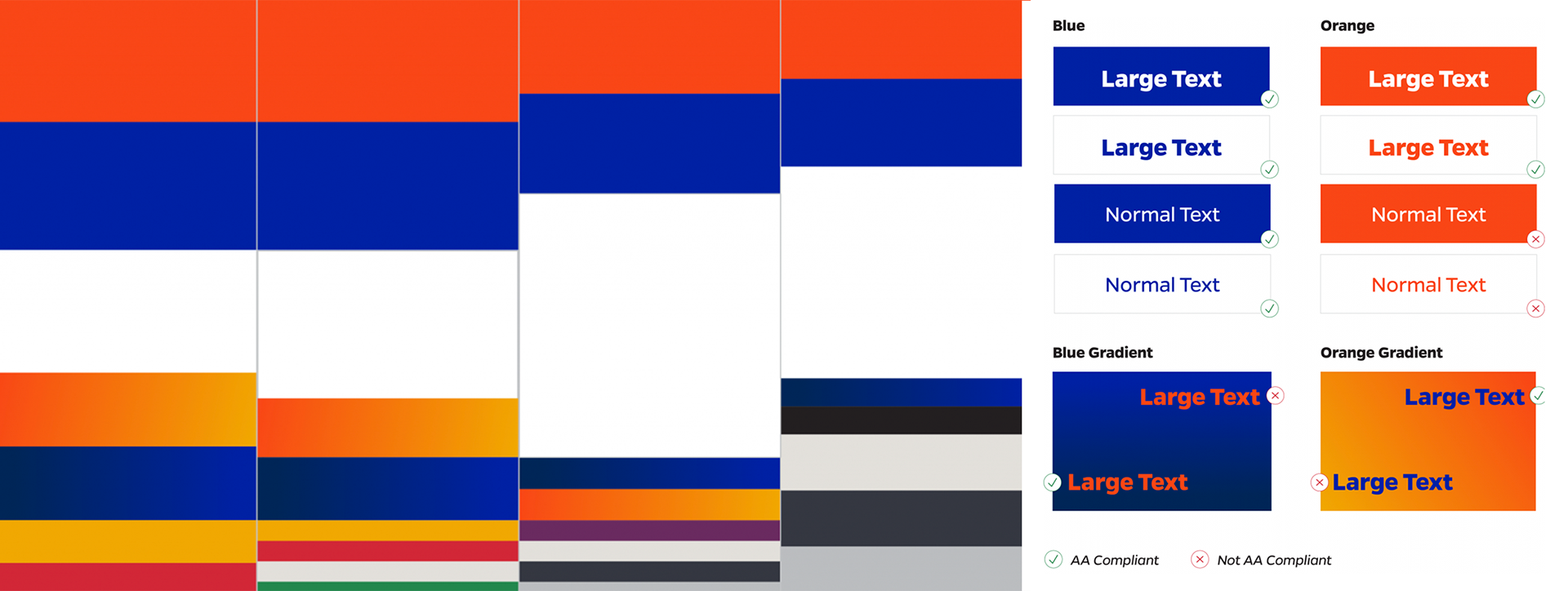
To build a site that was user-friendly and welcoming our team strictly adhered to UF style guidelines and web accessibility standards. We placed a focus on large, hyper-legible typography and high contrast color combinations.
WIREFRAME DESIGN
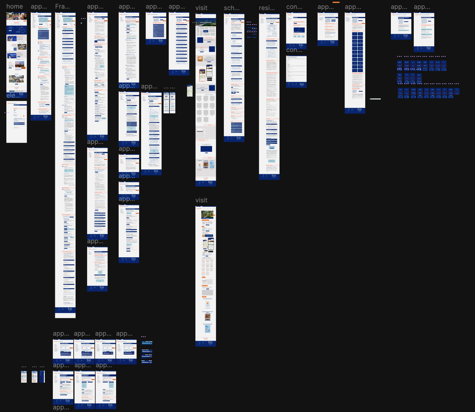
After extensive user research and testing the team took a strategic design approach. Our design solution not only modernized the website’s aesthetic and functional elements but also significantly improved its overall user experience.
DESIGN ELEMENTS
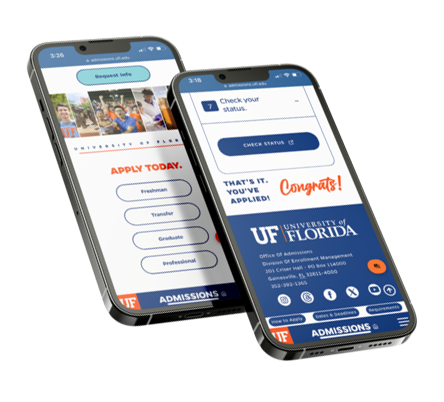
The floating side menu ensured ease of navigation and separated pages into clear-cut sections, no matter where a user is on the webpage.
We used color blocking and arrows to build an intuitive, easy-to-follow flow of information. Light blue boxes bring the user’s eyes to important information.
We emphasized words using a mix of typefaces and enhanced the visual appeal of text blocks by using attractive typography.

Drop down sections and expandable boxes with condensed copy were used to break up the overwhelming amount of text.
Founded in research and executed through highly thought-out and user tested designs the UF admissions website was revamped, now expressing a welcoming and engaging application experience.